Creating a website that captures attention, keeps visitors engaged, and encourages action isn’t just about colors and layouts. It’s about smart website design. But despite how easy website builders make it seem, many businesses still struggle to create a site that looks good and works well.
Why Good Design Still Fails
You may have seen websites that are visually striking but difficult to navigate. Or pages that load slowly and don’t work on mobile phones. The problem here isn’t a lack of creativity, it’s the lack of usability and strategic design thinking.
A poor website experience causes visitors to bounce quickly. In fact, a study by the Nielsen Norman Group found that users leave a webpage in just 10–20 seconds if they don’t find what they’re looking for. This means your design has a very short window to impress—and convert.
So what’s the solution? Smart website design rooted in function, strategy, and clarity. This blog shares 7 actionable website design tips that can help your site stand out for all the right reasons.
Simple Yet Best Website Design Tips That Work
-
Keep The Homepage Simple
Your homepage is often the first impression a visitor gets of your brand, and it matters. A clean, well-structured homepage removes distractions and highlights only the most important content. This helps visitors immediately understand who you are, what you offer, and what they should do next.
In contrast, a cluttered or visually noisy homepage can confuse users and drive them away. The goal is clarity and focus. Here’s how to achieve it:
Use eye-pleasing colors
Choose a limited color palette that complements your brand identity. Stick to two or three tones that feel balanced and professional. Avoid using too many colors, as this can overwhelm the eye and dilute your message.
Leverage white space effectively
Whitespace—or negative space—is not wasted space. It gives your content room to breathe, improves readability, and draws attention to key elements. A spacious layout also creates a sense of calm and clarity.
Use bold, minimal fonts
Stick with clean, modern typefaces that are easy to read across all devices. Bold, simple fonts enhance your message without competing with your visuals or layout. Avoid overly decorative or script fonts, which can reduce readability and look unprofessional.
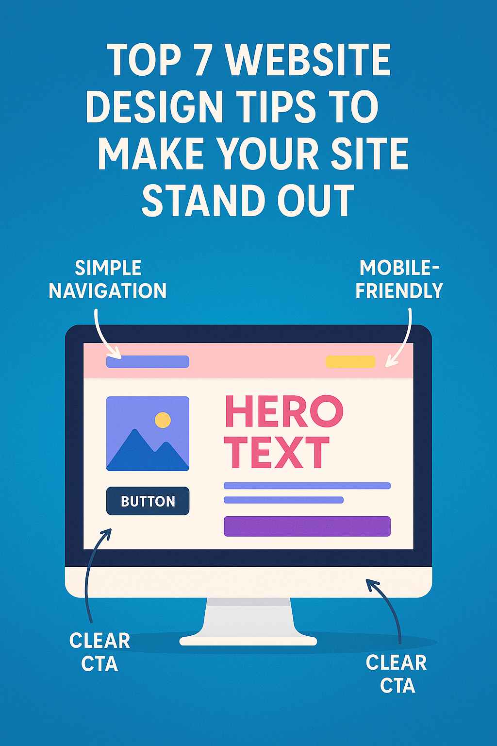
2. Keep Your Navigation Simple
You don’t want visitors getting lost while trying to find what they need. Navigation should guide them—not make things harder. If someone lands on your site looking for something specific but ends up clicking around aimlessly, they’ll likely leave before doing anything meaningful.
Keep your navigation clean and focused. Avoid overwhelming users with too many menu options, and group related pages where they make the most sense. Place important buttons like “Contact” or “Get Started” where they’re easy to see. When the path is clear, people are more likely to stay and take action.
3. Use Visual Hierarchy to Guide Attention
Visual hierarchy means arranging elements in a way that guides the viewer’s eye. It creates a structure that shows visitors what’s most important and where to look first. This is achieved through design choices like font size, color contrast, spacing, and placement.
Larger headlines naturally grab attention, while bold-colored buttons stand out from the rest of the page. Elements positioned at the top or center often get noticed first. Grouping related content and using whitespace effectively also helps create a clear visual flow.
Tools like Figma, Canva, or Adobe XD can help you visualize layouts before going live, so you can test what stands out and what doesn’t.
4. Choose Fonts That Are Easy to Read
Readable fonts make your content easier to understand and more comfortable to explore. They reduce eye strain, support accessibility, and help users quickly find the information they need—especially on mobile devices. When users don’t have to work hard to read, they’re more likely to stay engaged and take action.
Here’s how to choose fonts that improve readability:
- Use clean, screen-friendly fonts like Open Sans, Lato, or Roboto. These fonts are designed for digital use and render well across browsers and devices. Avoid decorative or script fonts for body text, they can be hard to read, especially in small sizes.
- Keep font sizes readable. Use 16px – 18px for body text on desktop. Increase size slightly for mobile to maintain comfort without zooming.
- Be consistent throughout the site. Set font weights, sizes, and styles for headings, subheadings, and paragraphs—and stick with them across all pages to guide attention and create a professional feel.
5. Make Sure It’s Mobile Responsive
Over 62% of global web traffic now comes from mobile devices. That’s more than half your audience browsing on phones or tablets. If your website isn’t built to adjust to smaller screens, visitors will struggle, and most won’t stick around.
A responsive site makes sure everything from text to images to buttons automatically fits any screen. This not only improves how your site looks, but also makes it easier to read, navigate, and interact with.
When your site works smoothly on mobile, users are more likely to explore, stay longer, and take action. Whether it’s filling out a form or clicking “Buy Now,” a good mobile experience leads to better results for your business.
6. Use Consistent Branding Across Pages
Your website should look and feel the same across all pages. When people move from one page to another, they should still feel like they’re on the same website. If the colors, fonts, or logo placement keep changing, it can confuse visitors and make your brand feel less trustworthy.
Use the same colors, fonts, and style of writing on every page. Keep your logo in the same spot and make sure everything matches your brand.
When your website looks consistent, it feels more professional. People are more likely to remember your brand and trust what they see. A clear and steady look across your site helps visitors stay focused and feel comfortable exploring.
7. Add Clear Calls to Action (CTAs)
A call to action (CTA) is a short message that tells people what to do next, like “Buy Now,” “Get a Free Quote,” or “Contact Us.” It helps guide visitors and makes their next step clear. Without a CTA, even someone who’s interested might leave without doing anything.
CTAs turn visitors into customers by pointing them in the right direction.
Keep your CTA short, clear, and easy to see. Add it where it makes sense—after explaining a product or service, in your header, or at the bottom of a page. When placed well, a CTA can help people take action and improve how your website performs.
Conclusion
Effective website design hinges on a balance of aesthetics and usability, ensuring that visitors not only find what they need quickly but also feel engaged and guided throughout their experience. By implementing these seven strategic tips, businesses can create a standout online presence that captivates users and drives meaningful action.
Want a website that brings all these strategies together—seamlessly? CreativeAlif designs websites that not only look stunning but are built to perform.