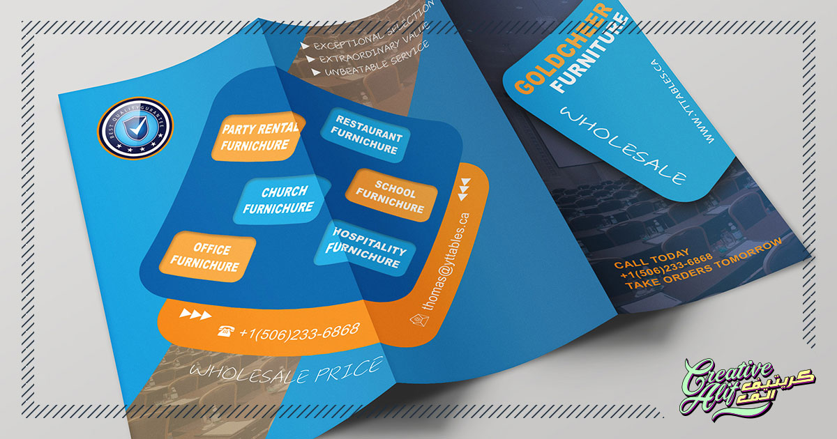
A typical middle-aged person is handed almost 70 brochures per year, and can come across 300 of them indirectly! When do you last remember coming across a brochure? Did you take the effort to read it, or did you just set it aside? Unfortunately, as high as the brochure generating statistics are, the number of brochures that end up in the bin is higher. Why would anyone think of inverting their time into something that’s not even paid attention to? If you wish to make your brochure attractive and appealing you have to make sure that when it’s handed to someone, the effort behind it shows.
The best brochure designs make sure to incorporate the best design elements with the correct messages, call to action, and accessible metrics to capture the interest of the prospect. The basics of brochure design are simple, yet complicated. This article will discuss the points a designer should keep in mind while creating the best brochure design for a company.
Crystal Clear Messages
Whether you’re designing the brochure to showcase your services or you’re custom-creating it for a new offer or deal, be sure to give the message out clearly. Also, the way you present your message is important. For example, if you’re advertising your friendly. the fun-loving attitude at your daycare center, the message should be in bright, vibrant colors. In contrast to that, if you’re designing one for corporate advisors then the attributes mentioned before will look too childish and your prospects will not take it seriously. Yes, the design should be eye-catching but should look professional and useful at the same time so that readers would want to invest their time into reading it.
Your Brand Identity
Your brochure should execute the aura of your brand. Don’t deviate from your brand identity while creating a product. For example, if you are a traveling agency which usually creates serene, calm imagery in their designs, don’t go out of the way to use vibrant colors for a discount offer of your travel deals. This will just end up confusing the customer. Use the elements that best suit your brand to create a uniform, undisturbed feel. Otherwise, it will just look that you’re trying too hard to get attention.
Keep Your Customers In Mind
That’s the main point for any designing project, is it good enough for your customers? Keep everything easy and straightforward, don’t go into complexity. Fr example, you can take a minimal approach by just asking a single question on the front page, to entice interest, or use your brand logo effectively. Also, keep in mind the region and ethnicity of your target clients. If you’re aiming for the middle east, it’ll be better to use Arabic logo designs and other elements in your brochure. You can also take a multilingual approach towards your brochure to attract more customers.
Use The Best Metrics
Metrics are the soul of every brochure. That’s because a brochure aims to serve a purpose, don’t just let it turn into a mere advertising tool. Basically meaning, your customer has reached your brochure so now what? what will he get out of it that he doesn’t already see in your other advertisement techniques? Give your readers value for their time.
How to do it? Simple, if you are showcasing a new store or location through your brochure, give out a coupon or a voucher to make sure the client will visit. If your aim is to increase your online presence and web traffic, then mention your URL to get people coming in. The best brochure designs tend to leave cliffhangers with their offers and deals on their brochure, which makes sure people will visit their website or stores to get the remaining details.
The brochure design mantra is simple, it should be direct, attractive and useful. The best brochure design companies will make sure you get a balance of all these elements so that your brochure serves it’s purpose effectively.