You might have a great product, a clear message, and a working website—but if your visual branding doesn’t connect, people may not remember you.
A lot of businesses struggle to keep their visuals consistent. They use random fonts, clashing colors, or mixed styles, and it makes their brand feel messy. This can confuse people and make the business look less professional.
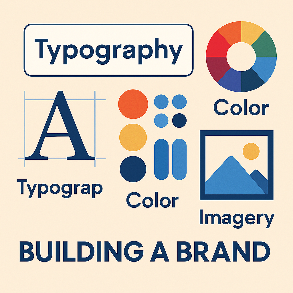
But you can fix this by focusing on three key parts of your visual brand: typography, color, and imagery. When these elements work together, they build a strong and memorable identity that helps people recognize and trust your brand.
What Is a Visual Brand?
Your visual brand is how your business looks. It includes your logo, colors, fonts, images, and overall design style. It’s what people see when they visit your website, scroll past your social posts, or hold your product in their hands.
Why does it matter? Because people notice design quickly. A 2022 study shows that brands with consistent visuals can grow their revenue by up to 23%. That means your visuals can directly help your business grow.
Typography: More Than Just Fonts
Typography is about choosing the right fonts and using them well. Fonts affect how your brand feels and how easy it is to read your content.
Why Fonts Matter
Fonts can make your brand feel serious, playful, modern, or classic. For example, serif fonts feel more traditional, while sans-serif fonts feel clean and modern. Decorative fonts might feel creative, but they’re not always easy to read.
How to Use Fonts Smartly
- Use no more than two fonts across your brand. One for headings and one for regular text.
- Make headings bigger and bolder so people can scan quickly.
- Avoid fancy fonts for body text—they’re harder to read.
Color: Setting the Right Mood
Color is one of the first things people notice about your brand. It sets the mood, creates emotion, and makes your brand easier to remember.
Why Color Matters
Colors have meaning. Blue often feels calm and trustworthy. Green feels natural. Red can feel bold and urgent. Using the right colors helps people understand your brand without needing to read a word.
A study by the Institute for Color Research found that up to 90% of first impressions are based on color alone. That’s a big deal.
How to Use Color Well
- Pick 2–3 brand colors that work well together.
- Use those colors on your logo, website, social media, and packaging.
- Use contrast (like a bright button on a white background) to draw attention.
Imagery: Telling Your Story Without Words
Images help people understand your brand in a quick, visual way. This includes photos, graphics, and illustrations you use on your website, ads, or social posts.
Why Imagery Matters
The pictures you choose show people what kind of brand you are. A skincare brand might use soft, natural photos. A fitness brand might use bold, high-energy images. Your visuals should match your tone and message.
How to Use Images That Fit
- Pick a style and stick to it—light or dark, real or illustrated, soft or bold.
- Edit your photos in the same way (same brightness, filters, or contrast).
- Choose visuals that support your message, not distract from it.
How to Bring It All Together
Your brand should look and feel the same everywhere—on your website, social media, product packaging, and ads. That’s what makes it easy for people to remember you.
Tips for Staying Consistent:
- Create a simple style guide with your fonts, colors, and image rules.
- Use design tools like Canva, Figma, or Adobe XD to keep your designs on-brand.
- Review your visuals from time to time to make sure everything still fits.
How Visual Branding Supports Digital Branding
Your visual brand is a big part of your digital branding. Whether someone visits your homepage or sees your Instagram post, your visuals speak for your business before you say anything.
When your logo, fonts, colors, and images work together, your brand looks trustworthy and easy to recognize. That’s why every design choice matters—especially if you’re offering services like logo design, packaging, or social media content.
Final Thoughts
In conclusion, effective visual branding through consistent typography, color, and imagery is essential for creating a memorable identity that builds recognition and trust in your business. By integrating these elements, you not only enhance your brand’s professionalism but also significantly boost your potential for growth and customer engagement.