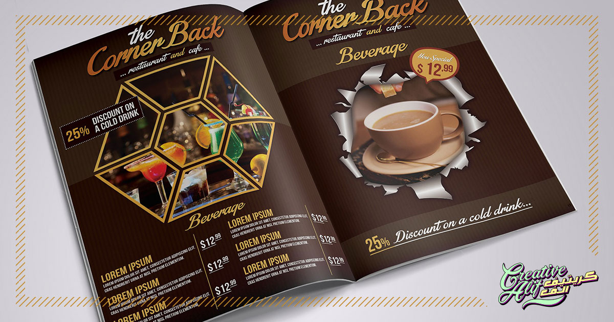
When creating a menu card design, the person in concern should be the user. You will be serving a person who is hungry and eager to order when creating a menu card, so naturally, it needs to be easy and clear. Other than that, your design should talk to your customer. The menu card is the only instrument apart from the interior design and environment of the restaurant which will appeal to your customer. So, it should be clear and effective enough to leave a lasting impression.
The best menu card design should display your brand identity through your best dishes and hearty offers. Here are some ideas for a menu card design that will ensure customer loyalty to your diner.
The Perfect Layout
The typical long, tedious listing can exhaust a customer and end up confusing him before he can order anything. Make your layout accessible and appealing. Divide your menu into, clear, direct sections. Avoid any clutter alongside columns that you don’t want to divert attention to. Also, it’ll be great if you use blocks and side sections for deals and family packages, to make the choice easier. The dish descriptions should be concise and include what’s delicious, don’t make it too long! No one wants to know your whole recipe. So, basically, keep the layout functional and easy to use.
You can also place drink options at the beginning of the menu card as customers tend to have drinks while they decide what to eat. Try to reach their minds and give them all the ease they need through your menu card which will make them want to come back.
Follow A Theme
Maintaining your brand identity is essential for your restaurant. The more appealing the theme of your restaurant is, the more customer flux you will receive regularly. Also, your menu card should follow the theme as well to match your restaurant’s all over feel. For example, if you are promoting wholesome eating and the usage of organic, healthy ingredients, your menu card should be made of recyclable materials and have a rustic design.
In contrast to that, if your restaurant showcases some sort of ethnicity like Chinese, Thai, or Mediterranean the menu card design should incorporate the symbols and design elements of that region. If your restaurant caters to the young minds, then make the menu card as vibrant and witty, full of puns and imagery to catch the young minds. The relation fo your menu card to the overall theme will show your eye to detail and perfection and build your customer trust.
Imagery
The images you use can be anything from your signature dish to a table layout of your best dishes, it’s your choice. But remember the photos you use should be of high-quality to give a realistic look. Don’t overdo it with the images. customers want to know what goes in the cooking, so written descriptions are the best. You’ll be in trouble if you give the images and they don’t show something the customer is allergic to, he’ll end up never coming back. Use your images for the interest of the user.
Also, you can get graphic design menu cards, with illustrations and design elements to support your descriptions. This will make it both attractive and accessible as well.
Minimalistic Approach
The purpose of the menu card is to display the food items available with an overview of their ingredients and cooking processes. Anything more than that will seem like a waste. Make sure you give the customer a value for their time. Cut out the clutter, avoid any extra restaurant descriptions or endorsements on the menu card. Keep it restrained to the food only. That doesn’t mean you should make it dull and meager but the purpose should be the star and all the other design elements should be there to support it, not to obstruct its effectiveness.
These are the main points you should keep in mind to increase your customer base through your menu card. The best design companies in Saudi Arabia make your cards attractive and easy to use which appeal to customers and make them want to come back.