The concept of packaging design has been around for some time now. It’s commonplace to see upgraded package designs for older products. This is because brands are recognizing the need to match with the latest trends to create the best package designs for their company. To make your box package design stand out, you will need to follow the latest trends as well.
In its purest form, graphic design is an art, which encompasses the feelings and emotions of people, in a creative way. Similarly, when this design appears on packages, you would want it to match the mindset of people you are targeting. As constant awareness and globalization are taking place, thinking and perception patterns of the population are evolving. So, for your product to get noticed, it’s box packaging will need to follow the newest trends in package designing. Here’s a list of the latest trends you might or might not know about.
Minimalism
Yes, the trending concept in fine arts has now bought its effect on commercial design as well. There only one technique for this style, just keep it simple. Minimalistic box packaging means that all the main aspects of your product should be on the visible side, the name, the basic component, USP, or tagline. Usually, single color concepts are used in such designing, elaborated by a comprehensible symbol. Yes, if you nail a symbol for your product that your customers can relate to, then minimalistic packaging will work wonders for you. You can check out logo design services from design companies as well to adorn your box with the best logo in Arabic or English.
Color Gradients
The best box packaging design companies make it a point to employ the best designers for packaging design. This concern about package design shows on the shelves these days. Amazingly designed gradients of all shades are evident in packaging styles. This gives a professional touch to common bright vibrant colors.
Unique Shapes
Gone are the days of straight, cylindrical bottles and square packages. Lately, you will see more of cuboid, hexagonal or even irregular shaped boxes and cases used for packaging. Bottles are also no strangers to these advancements. You’ll be seeing lots of cuboids, and irregularly shaped bottles this year.
Pastels
At the advent of feminism, this year we’ll be seeing a lot of pastel colors in box designs. Hues of light pink, blue, green and many other colors give relaxation and rustic feel to the eye. These colors make the package content more readable and prominent, thus, enhancing the utility of the product.
Doodling
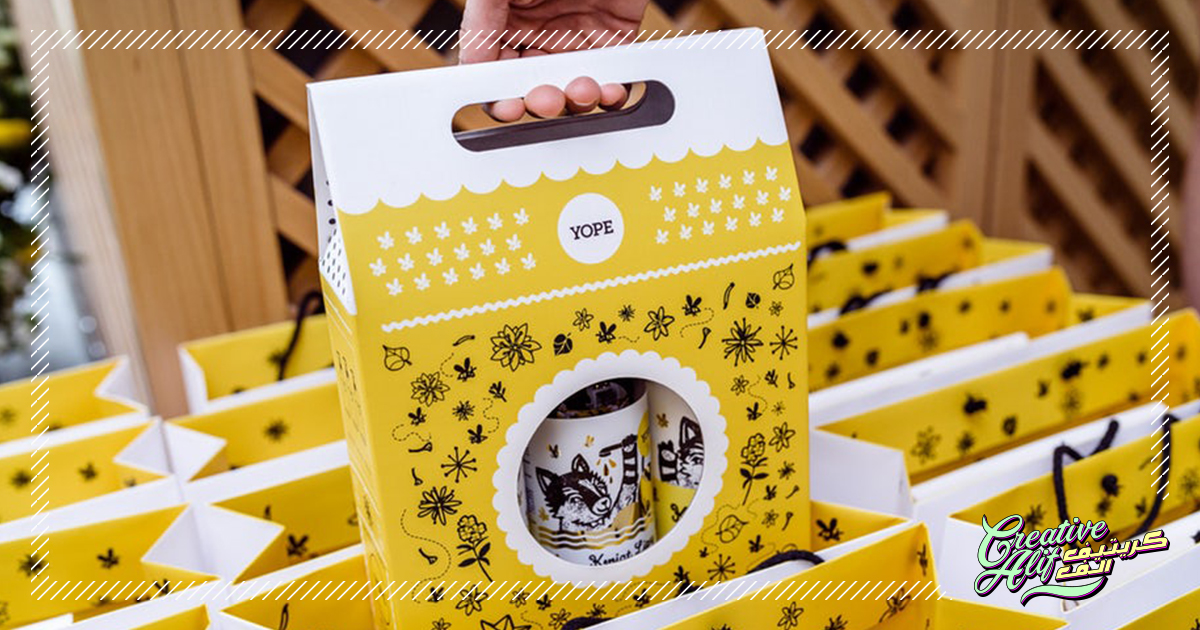
Here comes the best part. Creative doodle designs can be seen on many boxes these days and no doubt, they are effective. If you are looking for a middle eastern touch to your box package, package design companies in Saudi Arabia can incorporate Arabic Calligraphy in your boxes as well.
This sums up the latest design elements you should include in your box designs to make it stand out! To present your product in the best box design, visit Creativealif.com.