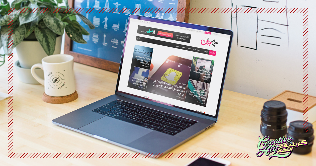
As Arabic is starting to make its stance online as the second-most used language, web portals using the Arabic language, have to use more and more user-friendly designs to increase their web traffic. while design and content are two main aspects in website designing, both of them are interconnected. The way of expression and setting of certain content is designed. This means they both have to create a balanced look together to create the best user experience.
Arabic website design has a similar approach to this point same as contemporary website design. To produce profit for online stores and increase their web flux is the primary goal, which depends on how well the website is designed to serve the user. let’s evaluate some points that Arabic website design companies should keep in mind for this issue.
The inclusion of CTA
The main point of creating a website is to reach out to potential customers. how well the website is designed depends on how well your clients can converse and contact you through it. That is why a call to action or CTA plays an important role. In Arabic web design this matter should be handled closely according to the language. While targeting the middle-east, these websites should provide responses to requests and queries in both Arabic and English. This is a must so that if a person takes your CTA seriously, it should not get rebuffed by your response.
Best of Both Worlds
Arabic website design companies in UAE usually provide both Arabic and English versions in the websites they create for their clients. this is very important to help middle-eastern entrepreneurs extend their reach beyond their language limits. Apart from that, it allows users all over the world to identify the services and merchandise provided by the sellers in their own language. This helps create a better UX.
Readable Typeface
The typeface of your website should be readable and legible for the user’s comfort. Therefore, the use of Arabic calligraphy and fonts is encouraged in Arabic websites to make it more coherent and easy to read.
The color of the CTA
The contact or call to action section on a website should use bright and eye-catching colors. This makes the user easily approach and identify this section. Because of that, more users will be attracted to this feature and increase the utility of the website.