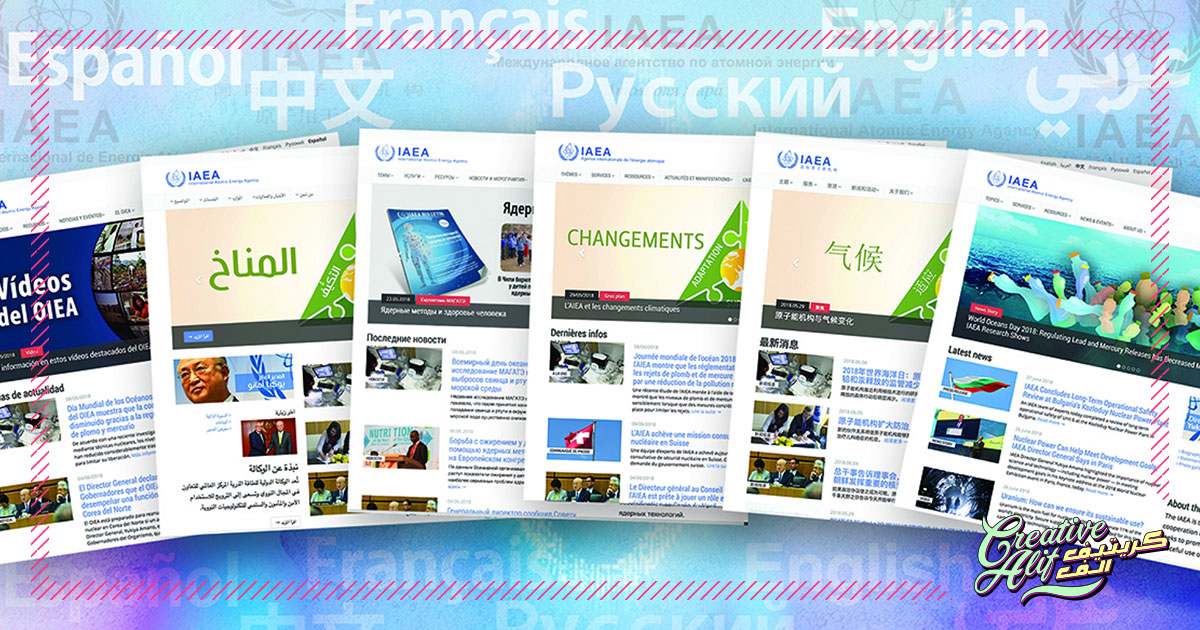
There about 6,900 languages spoken throughout the world today, and which language do you mostly see on the global platform? English. Yes, many will say that that’s because it’s the most commonly used and spoken language in the world. But, that is not the case either. In fact, English is preceded by Chinese and after that, Spanish as the first and second most used languages around the world. Also, Hindi and Arabic immediately follow English as the fourth and fifth in line. So, why don’t we see more of these languages on web pages?
The need for multiple language usage in websites is directly proportional to the global web traffic which is growing every day. As more and more people from different regions are rigorously using the internet, it creates a niche for multi-lingual websites. Designing these websites can be tricky and problematic, as it goes out of the norm. Here are some points website design companies should take into regard when creating the best multi-lingual websites.
Translations
Well, that can be left for Google to do, right? Incorrect. Google can prove to be a lot less efficient when translating original content for a native of that language. Tenses, synonyms and other language mechanisms need to be correctly stated otherwise you will risk looking unprofessional. It’s better to get your translations proofread before uploading to refine your writing from any grammatical errors.
Presentation of Language Options
You need to have visible and accessible language changing options. It’s a pity if you go through all the trouble to create multiple language versions of your website and the user can’t access it. Make sure the language switching option is visible on the top or bottom of your page. Also, it should be directly accessible for the user to identify it as a language switching option immediately.
Use of Flags
Some websites use flags as icons for language conversions. This can cause dire confusion. Firstly, the user might not know the colors of a flag or may fail to recognize it in the icon. It’s better to use the name of the language in the language itself so that the user can recognize it instantly, for example, العربية for Arabic instead of its English spelling, or Deutsch instead of German. This will make your multilingual website more user-friendly.
Default language
Select a default language carefully. This will depend on who your target audience is, or from which region your client belongs to. For example, if you are creating an Arabic logo design website, then your default language should be Arabic because more people of that native tongue will be visiting that portal. Most of the time, to create a diverse online flux, websites use English because of its official usage and general popularity.
Script Direction
This is also an important point to keep in mind. Remember that, the English script goes from left to right while the Arabic script is written from right to left. You will have to integrate your page settings in a way that switching from one language to another doesn’t seem disastrous to your layout. There are specific settings available on both HTML and CSS website setting for this purpose. Pay attention to that so your user can get the same experience in all language options.
Miscellaneous Considerations
A language is not only a mode of communication but also, it depicts a culture. All regions have different stereotypes about concepts such as gender, sexuality and general ethics. Make sure your website does not miss out on these details. For example, it’ll be completely okay to portray an image of a gay couple on a western website but it may be offensive to your middle-eastern viewers. So, with language, you need to take all these points into consideration as well. Also, the user should not feel that the translation seems to be forced or unnatural. Make them feel at home by using relatable imagery and idioms from the language. For that, you’ll need to employ language experts other than Google translate, to give your multilingual website a professional touch.