A menu card is to a restaurant what a showcase is to a showroom. The only way a customer can get first-hand information to the food you’re offering is through your menu card design. That means your menu card should be effectively designed with all the essential aspects included that make it functionally and aesthetically perfect. But, what are the basic components that a menu card design should have?
The components of a menu card depend on the cuisine and overall aura of the restaurant. Apart from these customized aspects, there are some main points that menu card designers should keep in mind in order to make them effective and enticing. Here are five tips to create the best menu card design for your restaurant.
1) Be Clear
Imagine that you are a person visiting a particular restaurant for the first time. How would you know it’s specialties and signature dishes? How would you find what you are looking for? This can only be achieved when the menu card you are looking at is clear and precise. Be sure to include lots of columns and sections to make the set up understandable and logical. Everything should not be just thrown on to paper. Make boxes or highlighted sections to signify your best attributes or exclusive offers. The clarity of a menu will keep the customer from getting confused and will help him find exactly what he needs with your customized recommendations.
2) Add Photos Where Needed
Some restaurants think the use of explicit imagery is an essential part of a menu card. Well, not necessarily. Large, 3D images of food servings are usually used by chain restaurants but most high-end restaurants avoid it to some extent. Yes, you can place an image or two at the front or in between sections, but that’s it. Just provide clear descriptions with creative names and let your dish presentation decide the rest. Going overboard with images will take the customers attention off the options and it may seem to deceive if the same dish is not served. Also, when adding images of your dishes make sure they are high-quality ones to maintain the image of your restaurant.
3) Use Illustrations
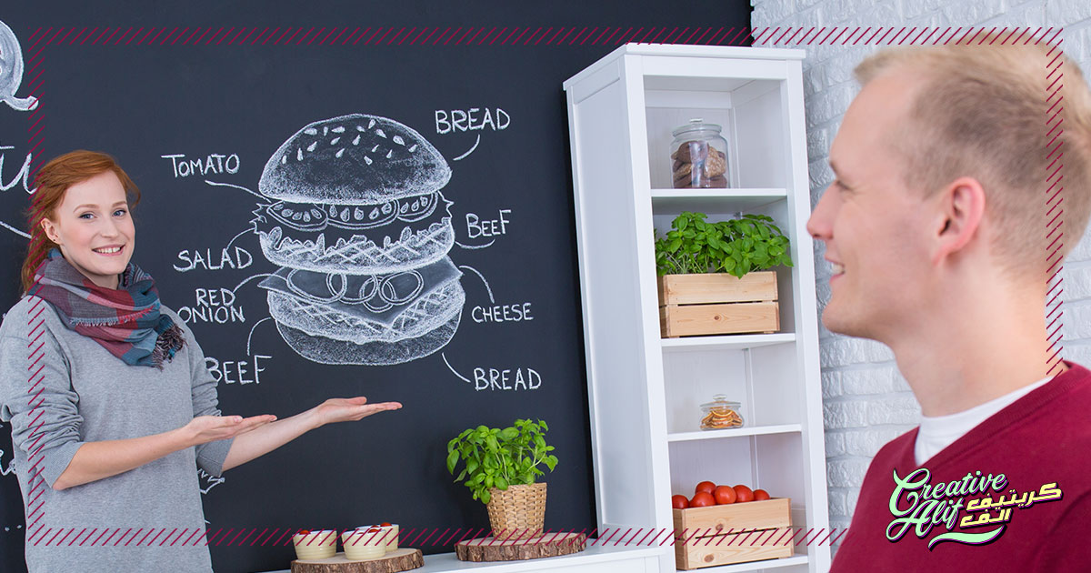
Instead of real images. illustrations can be fun to use in menu cards. Graphics design in menu cards enhances the zesty aspect of the food served and shows the effort behind minute details. This will give the customer an outlook of your quality and taste beforehand. You can use all kinds of graphic illustrations according to your restaurant’s image. If it’s a serene, dim-lit, relaxing spot use the illustrations accordingly. If you want to give a young, loud, and soulful feeling, go with bright, exuberant images to show the customers what they’re in for.
4) Keep The Prices Low-Key
Of course, all restaurants take money for their services, but you don’t have to be loud and boisterous about it. Everyone knows they have to part with their money, and customers will be sure to check the pricing even if it’s displayed in small fonts. The benefits of this little detail are great for your brand image. It will give your customers the impression you want to give regarding the quality of your food. It will showcase that your wish to serve the best comes before profits and revenue.
5) Design Components
In the best menu card designs, the typography, imagery, and colors should be on point. First of all, make sure to use the colors on your brand logo to give a uniform feel to your menu card. Also, you can use loud, vibrant colors to entice hunger and excitement to create the right mood. Secondly, the typography should be clear so that the names of the dishes are clear. No one wants to waste time reading through fancy swirls and curls while they’re hungry. Make your typographic patterns stand out clearly to avoid any confusion and extra hassle.
Summing it all up, your menu card needs to be attractive and functional both at the same time. A fancy one that doesn’t make the main components stand out is no use at all. Create a balance and see how effective your design is for your brand image.