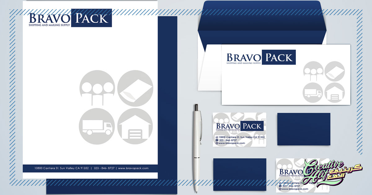
Stationery design is a professional and functional way to show your brand to the world. Though it serves an important purpose for all organizations, the importance of effective stationery design in corporate branding cannot be overstated.
The best stationery design for corporate branding should give out an aura of sleek professionalism. You want your prospects and clients to trust you, so you need to show your credibility through your designs. It can be anything from the boldness of your message to the functionality of your design and mater, you need to be the best. Follow these simple steps to make sure your design is presentable and shows a correct version of your brand to the masses.
Design According To Template
The letterhead will be usually used to create documents according to virtual word processors such as Microsoft Word. If that’s the case, you’ll need to arrange your design to fit the template properly. Otherwise, you will face problems while producing letters and official documents for your brand, and your design might face a malfunction while working. Also, you should decide on how much room you want for each component. If your letters are usually intended for routes like fax, you should leave out proper space for fax details.
Apart from that, company profiles and references will be included in the letters as well. As most company profiles tend to take up a lot of space make sure your design can facilitate that point.
Incorporate Uniformity
Consistency and uniformity, along with a personal touch are what corporate identity is all about. You don’t want to look like you’re going out of your way, but also, you wouldn’t want your stationery to get lost in the crowd as well. The best stationery design creates this balance.
Firstly, place all the important information in one color. This will include brand name and contact information. This arranges the information in an accessible way so the reader will get the connection at first glance. Also, using stark black will help you bring moderation to your printing costs.
Secondly, for corporate stationery design, don’t use shapes or sizes that are out of the norm. There’s a standard size for everything from envelopes to business cards in printers, pages, and even wallets! Going for something unusual in this case can make your stationery look absurd and unusable.
Make Final Checks
Make sure you check the information on your business cards and letterheads thoroughly. Or else, your client will end up getting incorrect information and you’ll waste a lot of money on redesigning and reprinting. Also, if your design is going to be used in a laser copier, then make sure your paper is suitable for that purpose. Invest in good quality paper and check the quality to place a good impact on your clients.
Printing
Decide beforehand how much of each component you are going to need. Printing your stationery can be a hassle, and you don’t want to go through that hassle again and again. So, set realistic statistics on how much you’ll need to use. Extra pieces will be a waste, and if you end up needing more than you printed, getting the whole set up reprinted can cost you more afterword. So get your counting right before starting the printing process.
Concluding this point, these are the basic ways you can emit professionalism through your corporate identity with the best stationery design. So let your clients get their hands on your brand details today, by getting your stationery designed by professionals.