Whether you’re managing your business or showcasing at an expo or trade show, your customers are always nearby. Most of the time, they prefer to learn about your business through a brochure rather than directly from you. Before even picking up a brochure, they’ll quickly scan it to see if it catches their eye. If you want to keep them engaged and prevent them from just passing by your store or booth, here are 9 Best Tips to Make Your Brochure Design Stand Out!
BEST TIPS TO MAKE THE BEST BROCHURE
1) WHAT IS THE MAIN PURPOSE?
Before diving into design, clearly define your brochure’s objective. Are you promoting a new product launch? Highlighting company services? Identifying the core goal ensures your content aligns with this purpose.
2) WHO IS YOUR AUDIENCE?
Knowing your audience is key. Find out their age, gender, and income to customize your message and images. Learn about their passions and pain areas to develop content that connects. Your brochure can demonstrate how your product or service can solve their problems.
3) WRITE ATTRACTIVE HEADLINES
Think of headlines as your brochure’s first impression. Craft clear, concise, and benefit-oriented headlines that pique readers’ curiosity and entice them to delve deeper.
4) CRAFT COMPELLING AND PERSUASIVE CONTENT
Although design may result in interested customers the content should get them hooked.
Make sure your brochure doesn’t get tossed aside! Create an attention-grabbing headline that defines your offering in a nutshell. Rather than focusing on the product’s qualities, highlight how it enhances people’s lives. Because of the constraints of the space available, make sure that each word counts.
5) USE MINIMALIST DESIGNS
Minimalist layouts emphasize simplicity, clarity, and white space to highlight crucial information. The elegance and professionalism of these papers make them versatile. Minimalist designs are easy to understand and convey product characteristics or points.
6) ADOPT DIFFERENT FOLD FORMATS
Go beyond the traditional tri-fold! Experiment with different fold formats such as gatefolds or accordion folds. These alternative formats offer a fresh and captivating way to present your content.
7) PICK THE BEST PICTURES
High-quality visuals are essential. High-quality visuals not only capture attention but also convey your message effectively. Choose images that align with your content and appeal to your target audience.
8) CHOOSE APPEALING COLOR SCHEMES
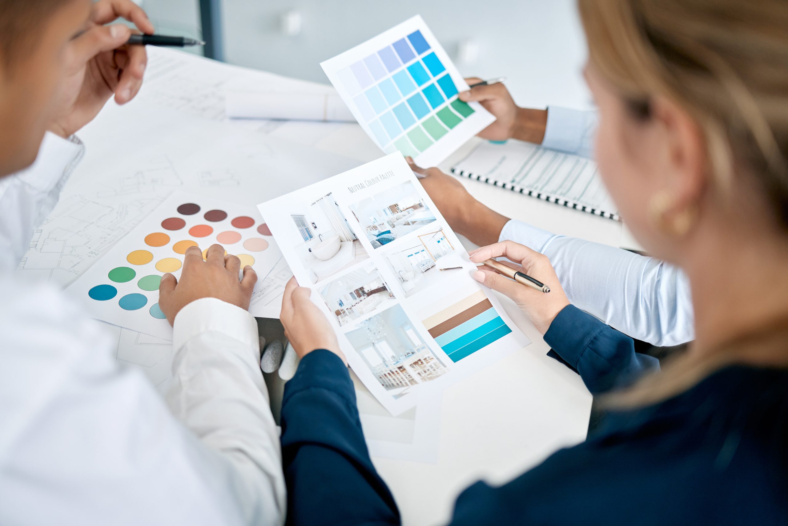
Colors evoke emotions and influence perception. Color psychology is crucial to know about that aligns with your brand identity and target audience. Remember, bold colors can grab attention, while softer tones create a more calming effect.
9) CALL-TO-ACTION (CTA)
Don’t leave readers hanging! Include a clear and compelling call to action (CTA) that tells them what you want them to do next, whether it’s visiting your website, contacting you for a quote, or attending an event.
If you’re looking for expert brochure design, Creative Alif is here to help. In addition to the techniques mentioned above, our team uses secret methods to ensure your brochure stands out and boosts your brand’s visibility. We understand the importance of a well-designed brochure as a marketing tool, so we’re committed to making your brand’s brochure exceptional.