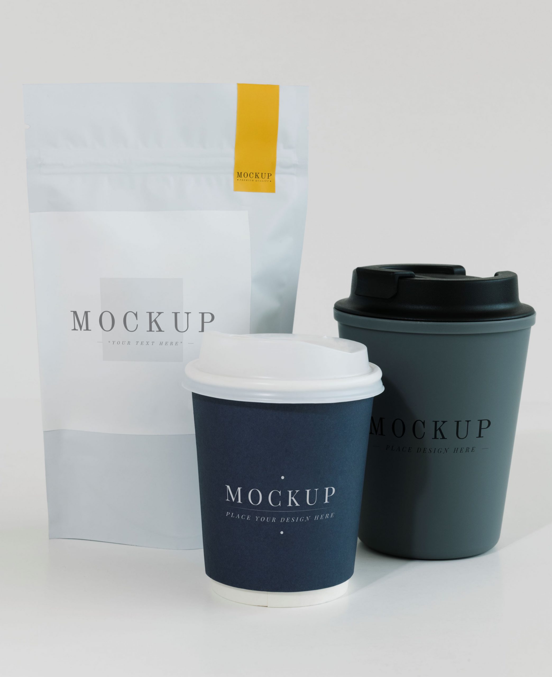
Products battle for your attention everywhere these days, online and in stores. But in this crazy rush, simple design cuts through the noise. Minimalist packaging ditches the clutter, uses clean lines, and focuses on what matters – the product itself. It’s a breath of fresh air in today’s busy world.
Key Elements of Minimalist Packaging
- Clean Lines and Simplicity: Forget busy graphics and overwhelming text. Minimalism embraces clean lines, opting for simple shapes with a sleek, understated aesthetic. It’s like a breath of fresh air for your eyes, allowing the product to take center stage.
- Limited Color Palette: Think calming neutrals and muted pastels. Minimalist packaging often employs a limited color palette, with whites, blacks, greys, and soft hues setting the tone. This creates a sense of sophistication and lets the product’s natural beauty speak for itself.
- Whitespace: It might sound counterintuitive, but space is a powerful tool in minimalist design. Whitespace – or negative space – allows elements to breathe. It creates visual balance, drawing your eye to key features: the product itself or a subtle logo.
- Typography: When it comes to typography, minimalism keeps things clean and clear. Think sans-serif fonts – letters without little decorative flourishes. Messaging is concise, with bold lettering used sparingly to convey essential information or brand identity. It’s all about keeping the message focused and impactful.
- Functional Design: Functionality is king in minimalist packaging. Every element serves a purpose. The packaging protects the product, is easy to use, and might even enhance the excitement of opening it (think of those satisfyingly designed boxes). It’s not just about aesthetics; it’s about creating a thoughtful user experience.
Conclusion
Minimalism is powerful, but striking the right balance is key. Our design experts weave brand identity into elegant simplicity, redefining minimalist packaging for the modern market.